Cincinnati Chamber Orchestra Posters
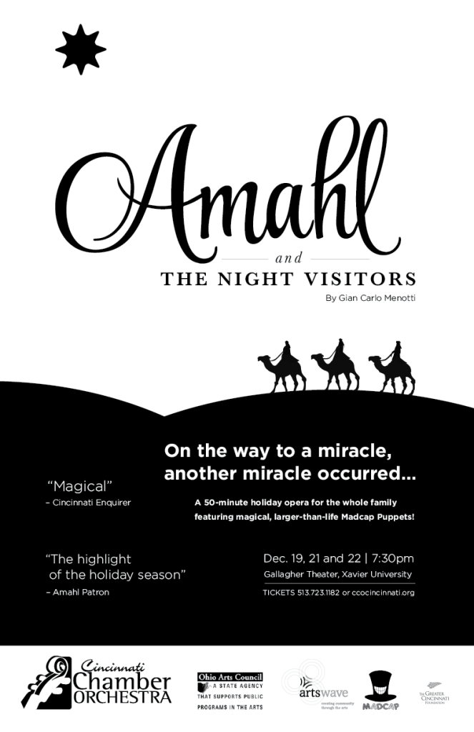
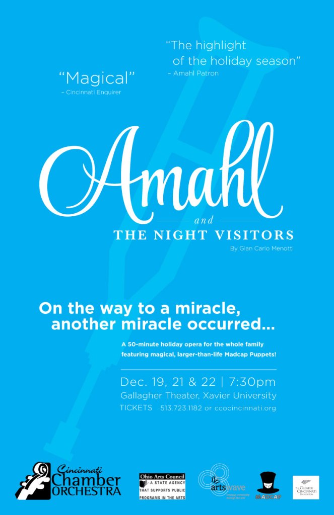
I volunteered at the Cincinnati Chamber Orchestra and they requested posters to be created for their opera “Amahl and The Night Visitors”. Using Illustrator, I created 3 different versions. I focused on creating vector graphics as I wanted to try a different approach from the senior graphic designer I was working with. She was using photos from the past productions of the play. The first poster has a black and white color scheme to emphasize the prestigious nature of it being an opera and the subject matter relating to the 3 wise men from the Bible.

The second has a mix of green and blue colors that emphasize the magical playfulness of the puppetry and that the opera is aimed towards children. The third poster highlights the crutches that the main character Amahl relies on and has a nice, simpler aesthetic compared to the others. Although the posters were ultimately not used I still enjoyed the creation process immensely.
Findlay Market Posters

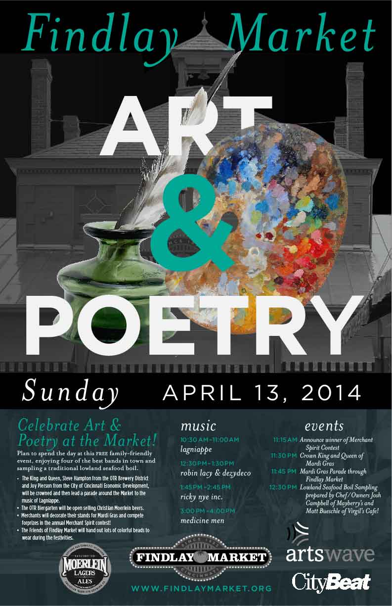
Findlay Market needed posters for different events happening throughout the year; each with a consistent look but also to emphasize the difference of each event. Created with Photoshop, the main difference in each is the color and the image used. The main image of the market house in the background as well as the words “Findlay Market” were already a part of the template I was given, as was the separation with the black bar, the typefaces to be used, and the logos at the bottom of the page.

The Reds Opening Day Parade event used a mix of red and white to highlight the baseball theme and the cool blue fades into the background to compliment the other colors. Art and Poetry uses a grayscale tone in the background to make the foreground image pop. Mardi Gras uses the signature purple, yellow and green colors while the Chili Cook Off green and yellow tones contrast with the hot red of the pepper as well as call to mind the colors of other peppers.
I made sure that the photographic images interacted with the text in pleasing ways. For instance, the baseball overlaps the “E” in “Reds” and the “D” in “Parade” and the quill in “Art and Poetry” goes through the “R”. Not only is it visually pleasing, it engages the viewer to look longer at the poster.

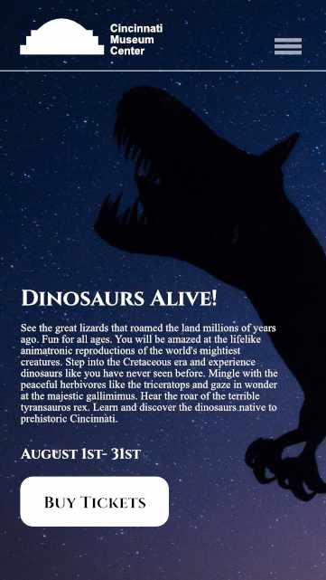
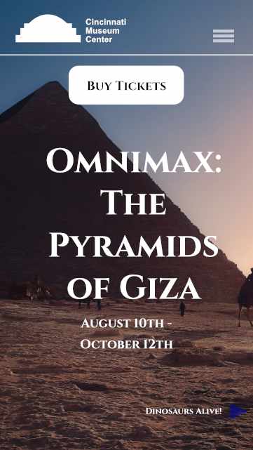
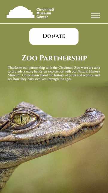
Cincinnati Museum Center Website Design


I kept mobile in mind as I designed with the ability to scroll through each page or tap the hamburger icon in the top right for a quicker view. The mockup was created with a combination of Affinity Designer and Photo.
I visited the Cincinnati Museum Center website in the Fall of 2020 and felt like it lacked potential. I wanted to design a site with more images and color, something that would make it fun to look at and entice people to visit. I focused heavily on large photos with brilliant colors and shapes.


Mobile Version


Galen College of Nursing Student Handouts
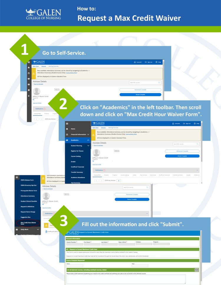

A series of handouts created with simplicity in mind and keeping inline with the brand standard colors. Using screenshots, I broke down the process of each task and numbered them accordingly.
The creation of these student handouts have significantly reduced the number of questions we have received in the registrar’s office.
Galen College of Nursing Welcome Week

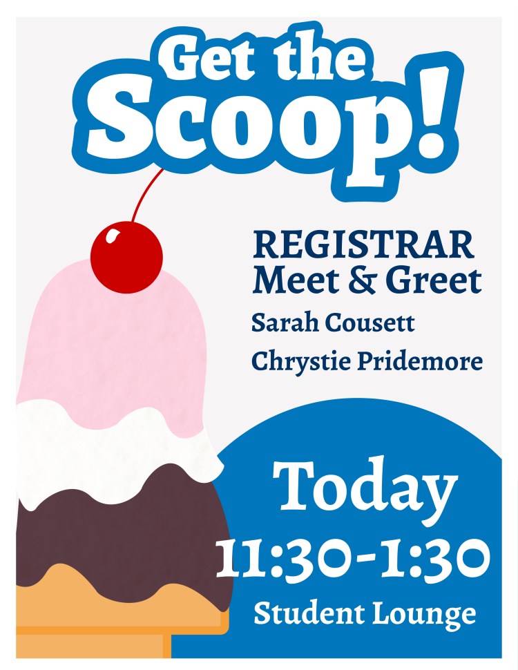
Part of a series of small prints hung around campus welcoming students back to classes. “Get the Scoop” is an ice cream social while “Cool Cups” was created to advertise an iced coffee meet and greet. Created in Figma the text exhibits a blue bubbly outline to indicate playfulness and welcoming atmosphere of Welcome Week as well as to maintain that both prints belong to the same group.
Galen blue colors were used to keep with the Galen theme with a mix of warm browns for the coffee and red and pink tones for the cherry and ice cream. Subtle textures were added to the illustrations to give them more depth and eye appeal.
Galen College of Nursing Camp Nightingale

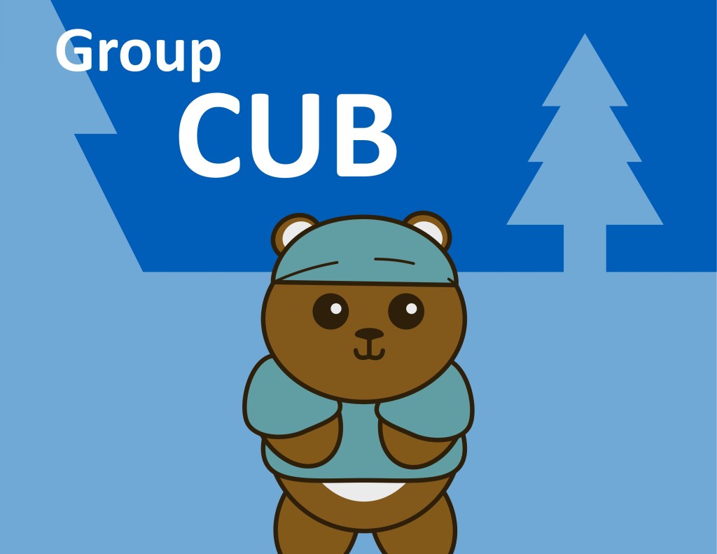

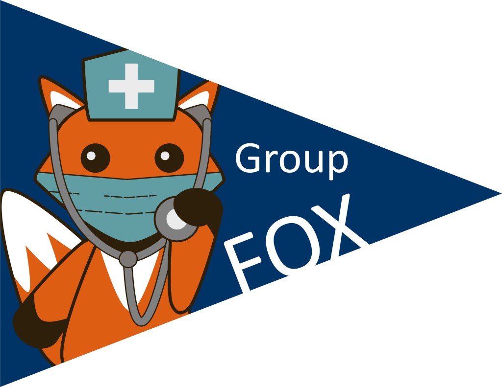
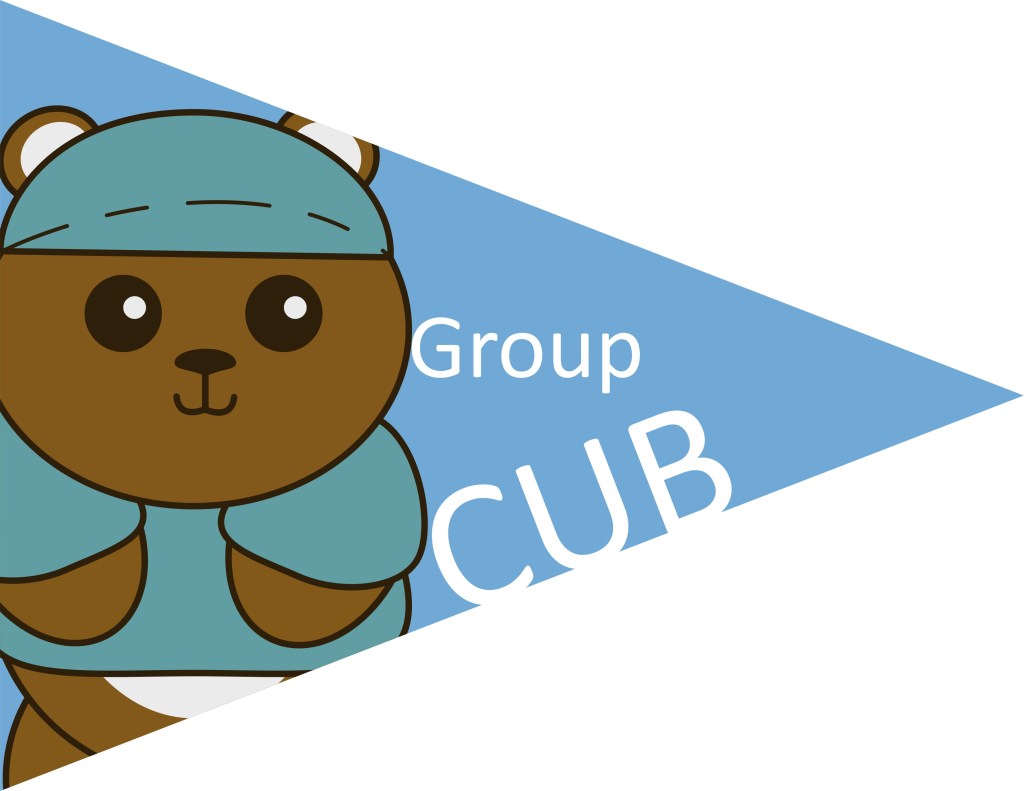
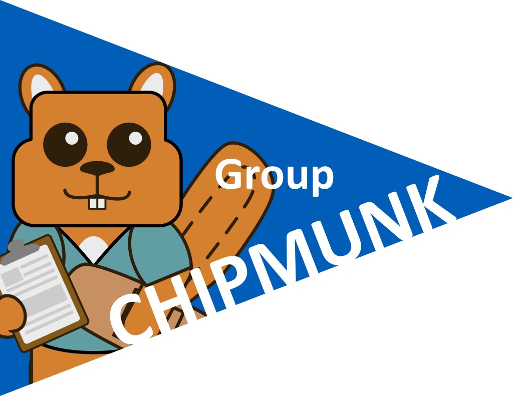
A series of fun signs created for the Cincinnati Camp Nightingale event. Camp Nightingale focused on students going into their clinicals and was summer camp-themed hence the woodland animals wearing nursing attire. The cutesy look to the animals was meant to convey the newness, almost child-like presence, the students have to the world of nursing.
These images were used to break the student’s into 3 groups for round-robin style class rotations. The triangles were flags that were printed and taped to poles used by the camp “counselors” aka student ambassadors as they led the students to the different classrooms. The background used a combination of cool Galen blues and a simple non-imposing fir tree. The foreground figures use warmer colors to help stand out from the background. Overall the camp was successful and the student’s enjoyed the camp theme.
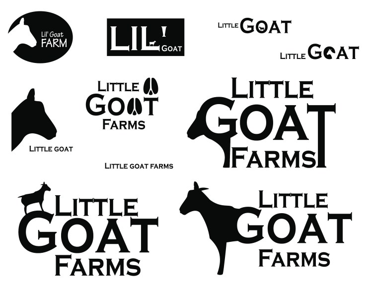
Little Goat Farms Logo Design
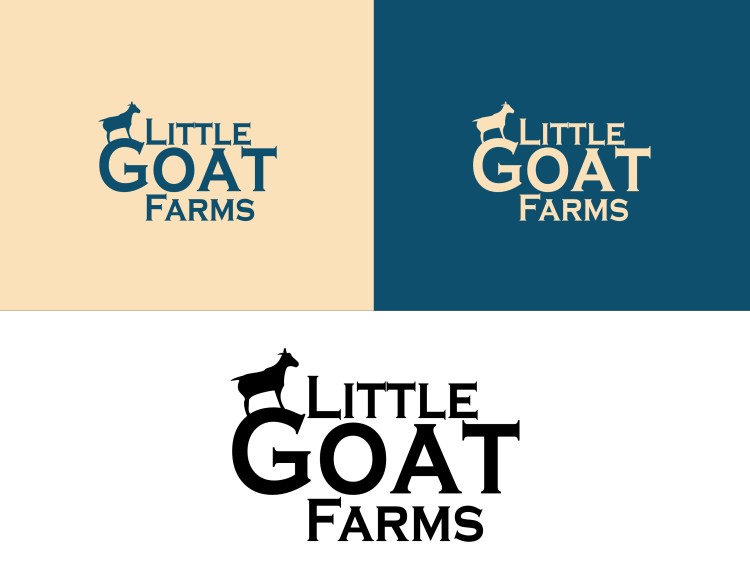
Little Goat Farms needed a logo and brand colors to sell their merchandise and use for their marketing materials. I started with a series of sketches followed by black and white silhouettes made in Affinity Designer.
I settled on the small goat climbing on the “G” as, not only is it a little goat, but goats are known to climb things. I felt as though the stacked logo reads well at different sizes.
Colors were explored and it was debated whether it should have a warm or reddish tone to relate to hunger, however that idea was discarded in favor of something happier and providing a feeling of calm, hence the blue and yellow tones in the final.